About the project
For over 15 years, Markswebb researchers have been finding, describing, and fixing UX problems in digital services. We’ve seen thousands of interfaces and finally decided to formalize our accumulated knowledge as a classification and knowledge base for everyone building and improving mobile apps, web versions, sites, and personal accounts.
This landing page gathers all project artefacts to help you sharpen the skill of identifying and describing UX problems — so research insights turn into real, useful changes for people and for business.
Using the Markswebb classification and other UX Problems Guide materials helps UX researchers, designers, CX specialists, and product teams get to the root of interface issues and, as a result, find better solutions. It’s also a source of inspiration, with examples collected from 80+ digital services and hundreds of user scenarios. If you stitch together all the visualizations of problems and solutions we found, you’d get over 24 hours of video—that’s how much we analyzed to select only the most important and valuable.
UX problems classification
 1. The service is not adapted to the user’s task
UX problems caused by the service’s inability to meet users’ needs.
1. The service is not adapted to the user’s task
UX problems caused by the service’s inability to meet users’ needs.
 2. No clear path to the needed function or information
Situations where key functions or data are hard to find due to navigation quirks, misleading names, or misplaced priorities in the interface.
2. No clear path to the needed function or information
Situations where key functions or data are hard to find due to navigation quirks, misleading names, or misplaced priorities in the interface.
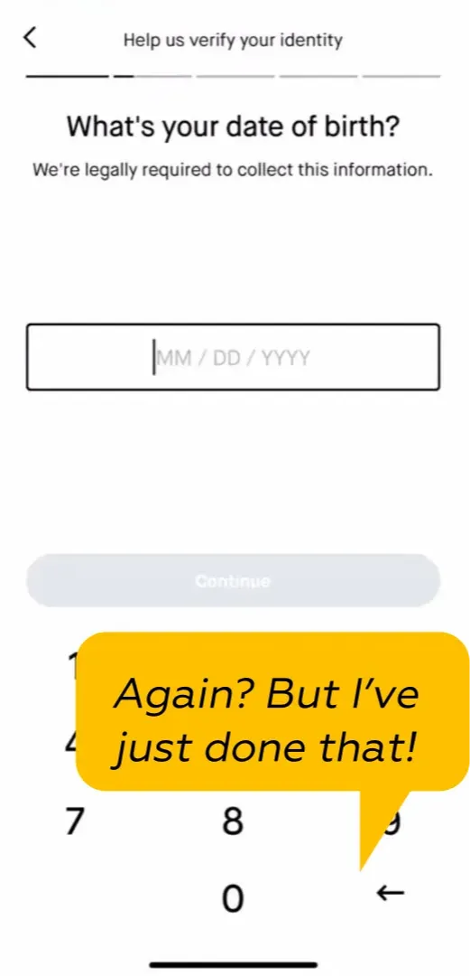
 3. Users have to perform too many actions
Errors arise when the system doesn’t protect users from missteps, overloads them with extra steps, or fails to match their mental model.
3. Users have to perform too many actions
Errors arise when the system doesn’t protect users from missteps, overloads them with extra steps, or fails to match their mental model.
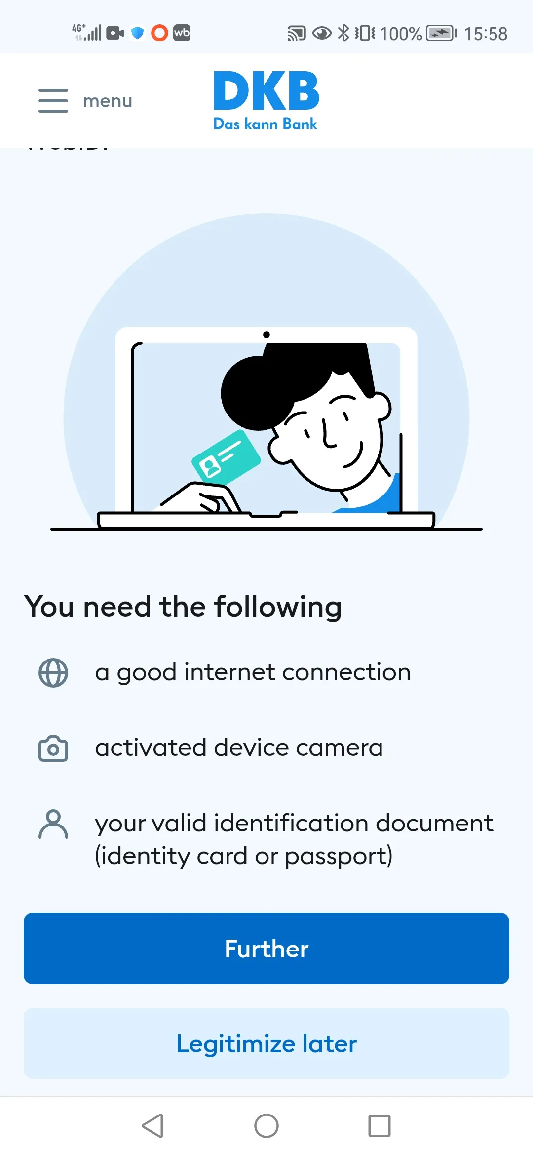
 4. Users have to wait too long for results
UX issues caused by slow system responses or prolonged loading, which disrupt workflows and undermine perceived reliability and efficiency.
4. Users have to wait too long for results
UX issues caused by slow system responses or prolonged loading, which disrupt workflows and undermine perceived reliability and efficiency.
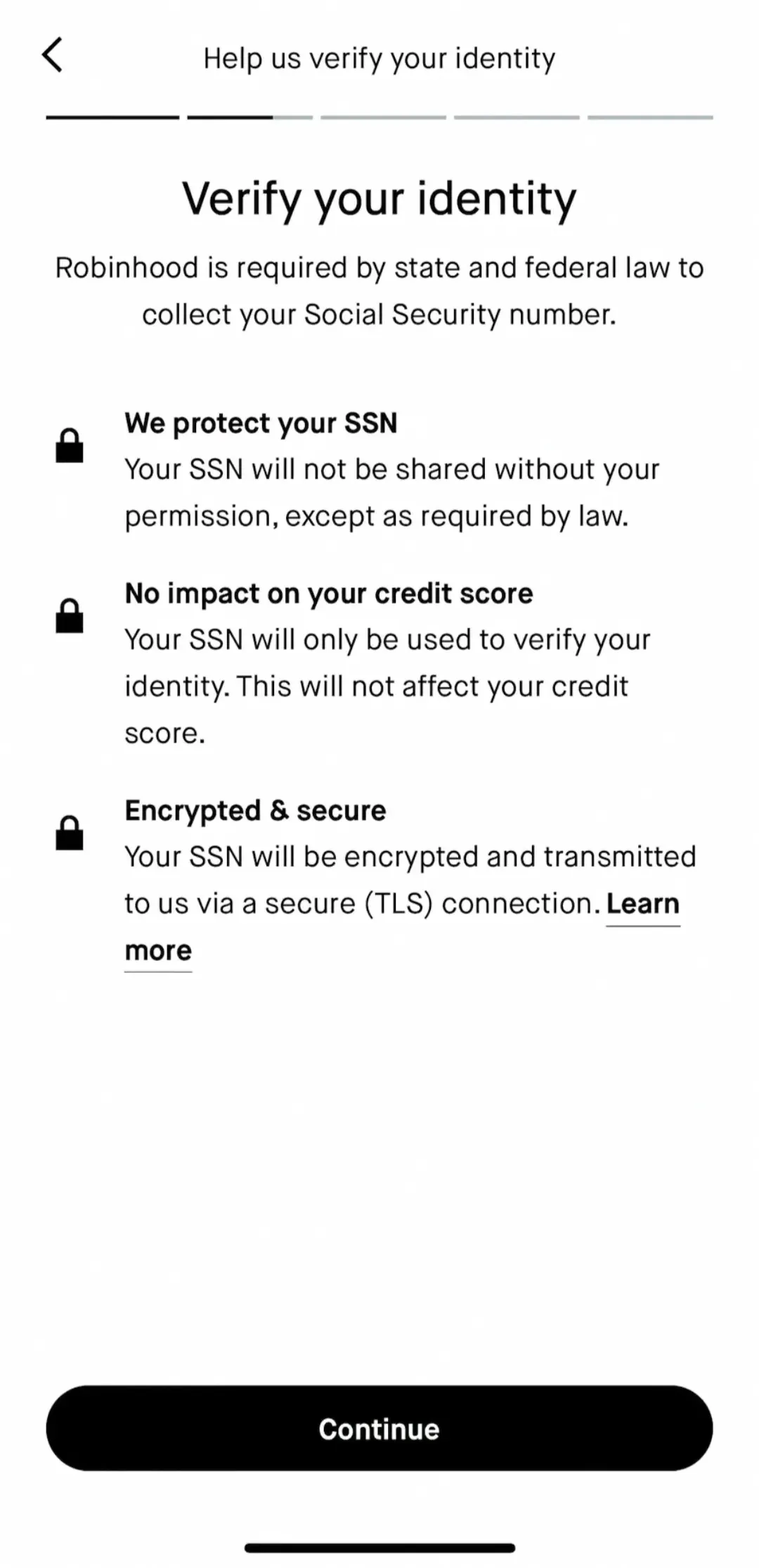
 5. Users don’t understand what action is needed
The service doesn’t provide clear, helpful guidance, leaving users unsure about what to do next.
5. Users don’t understand what action is needed
The service doesn’t provide clear, helpful guidance, leaving users unsure about what to do next.
 6. Users don’t know where they are
Navigation and wayfinding problems typical of complex or non-obvious user paths.
6. Users don’t know where they are
Navigation and wayfinding problems typical of complex or non-obvious user paths.
 7. It’s hard to perform an action without mistakes
Issues that increase error likelihood due to missing safeguards, excessive requirements, or designs that don’t align with user logic.
7. It’s hard to perform an action without mistakes
Issues that increase error likelihood due to missing safeguards, excessive requirements, or designs that don’t align with user logic.
 8. The service misleads users
Ambiguous or deceptive interface elements cause users to misinterpret actions, leading to errors and reduced trust.
8. The service misleads users
Ambiguous or deceptive interface elements cause users to misinterpret actions, leading to errors and reduced trust.
 9. Users don’t feel informed
Cases where clear, timely feedback is missing—users feel lost and don’t understand what’s happening.
9. Users don’t feel informed
Cases where clear, timely feedback is missing—users feel lost and don’t understand what’s happening.
 10. The service feels unfamiliar or illogical
Non-standard or inconsistent patterns break user expectations, complicate interaction, and reduce ease of use.
10. The service feels unfamiliar or illogical
Non-standard or inconsistent patterns break user expectations, complicate interaction, and reduce ease of use.
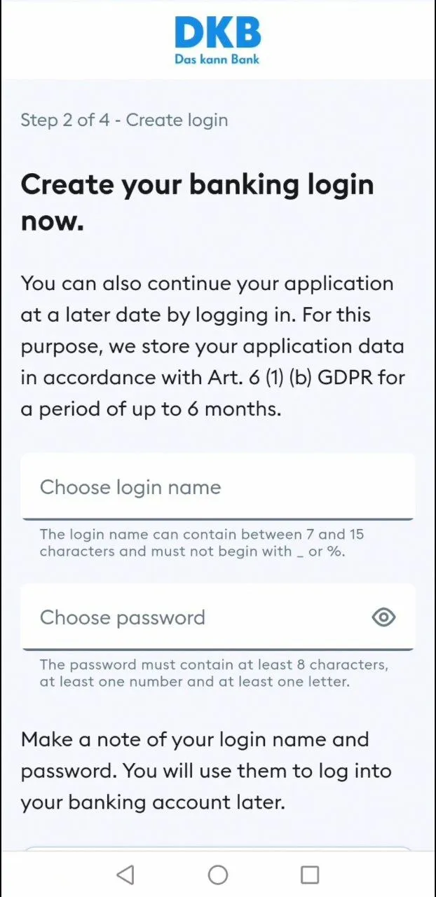
 11. Language and interface elements are hard to understand
Terminology and UI barriers prevent users from correctly interpreting or using the interface.
11. Language and interface elements are hard to understand
Terminology and UI barriers prevent users from correctly interpreting or using the interface.
 12. Users’ eyes get tired quickly while using the service
Design choices that overload perception and hinder effective interaction, reducing overall comfort and usability.
12. Users’ eyes get tired quickly while using the service
Design choices that overload perception and hinder effective interaction, reducing overall comfort and usability.
How the classification will help
The classification broadens the set of criteria UX researchers and product managers can use to evaluate an interface. Every new class you study reveals issues that would otherwise go unnoticed — and unfixed.
Improve product quality and awareness
- After getting familiar with the classification, examples, and solutions, you’ll start spotting problematic cases in your own product more often.
- Refer back to the project documents to clarify details, check examples, confirm it’s the same case, and review recommendations and ways to avoid the problem.
- Apply the knowledge in your product.
Use the classification as an audit framework
- Study the classification to structure your knowledge about UX problems.
- To verify your design decisions for problem-free launch readiness, use Markswebb checklists.
- Revisit the classification over time to learn new classes, spot new problems, and adopt best practices.
Cite the classification to make your case
- If it’s hard to convince colleagues of the importance of a UX problem or a change, share the classification with them.
- Find the relevant classes, study examples of problems and best practices—see how they’re described and how users react.
- It becomes easier to find the right words to explain to the team and stakeholders what the problem is, why it matters, and how to fix it.
Your toolkit: dataset, stats & checklists
In addition to the classification, we suggest reviewing a statistical report on how frequently UX problems appear across five industries—and using Markswebb’s industry checklists for independent audits.
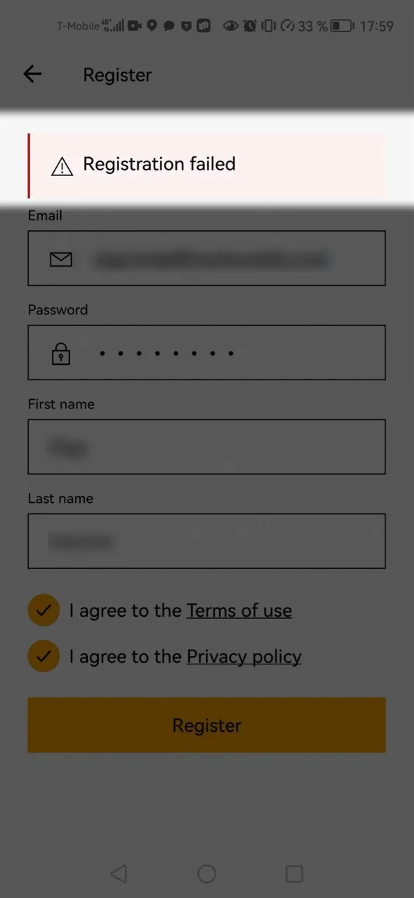
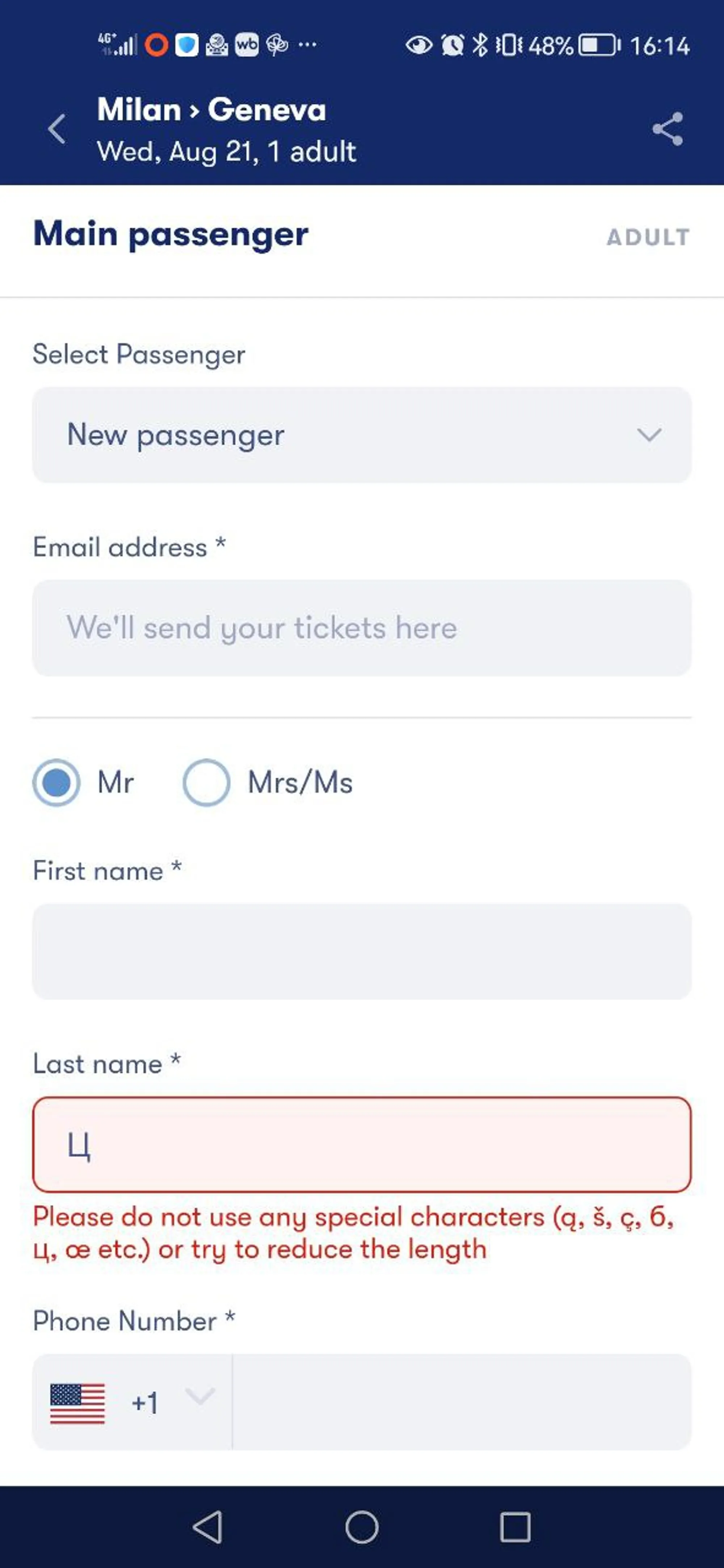
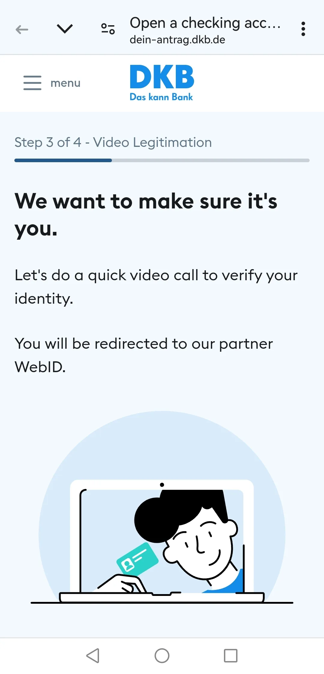
UX problems dataset
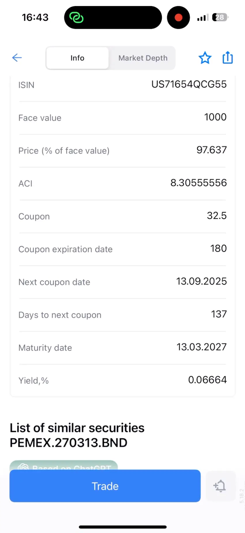
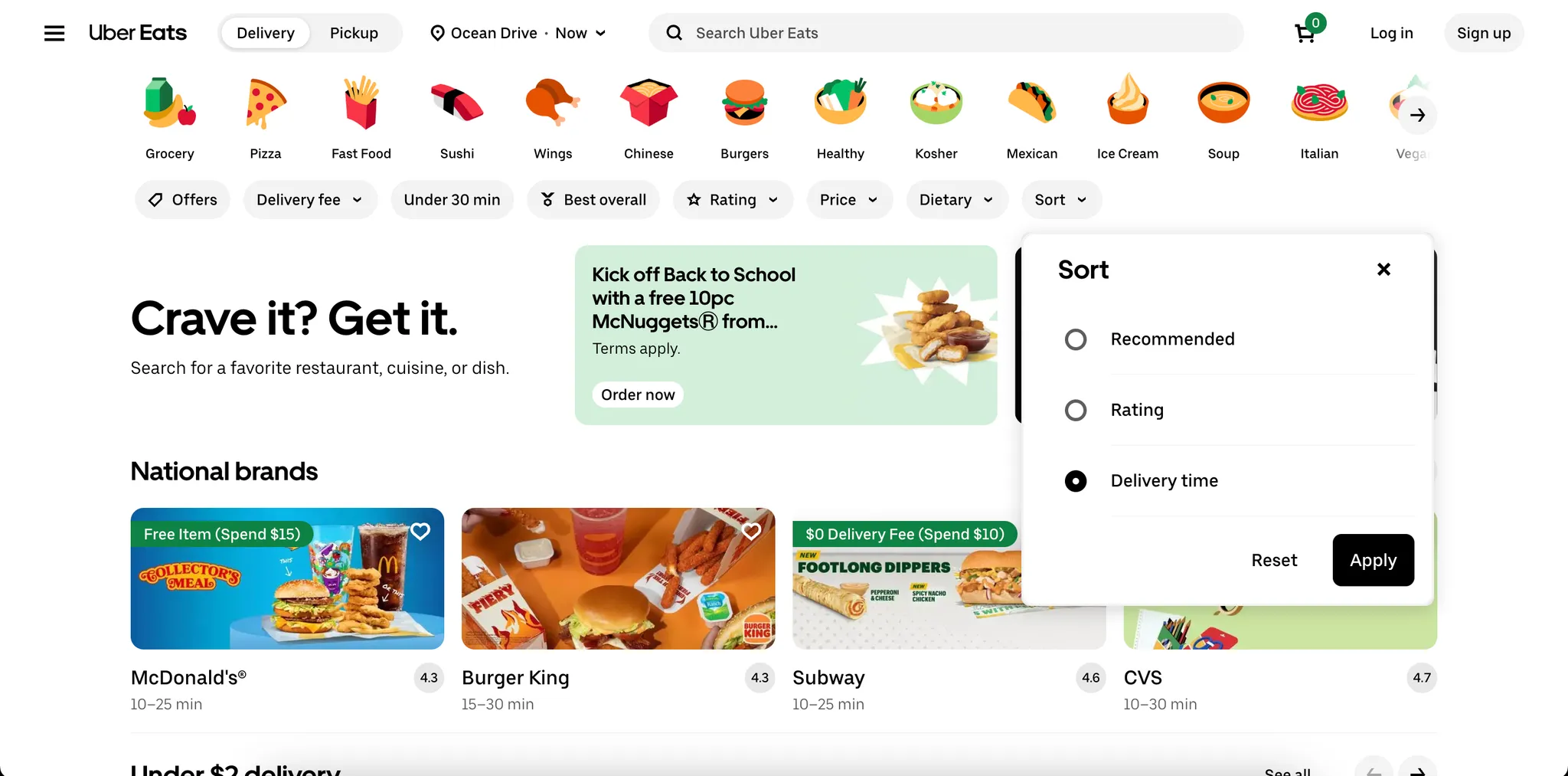
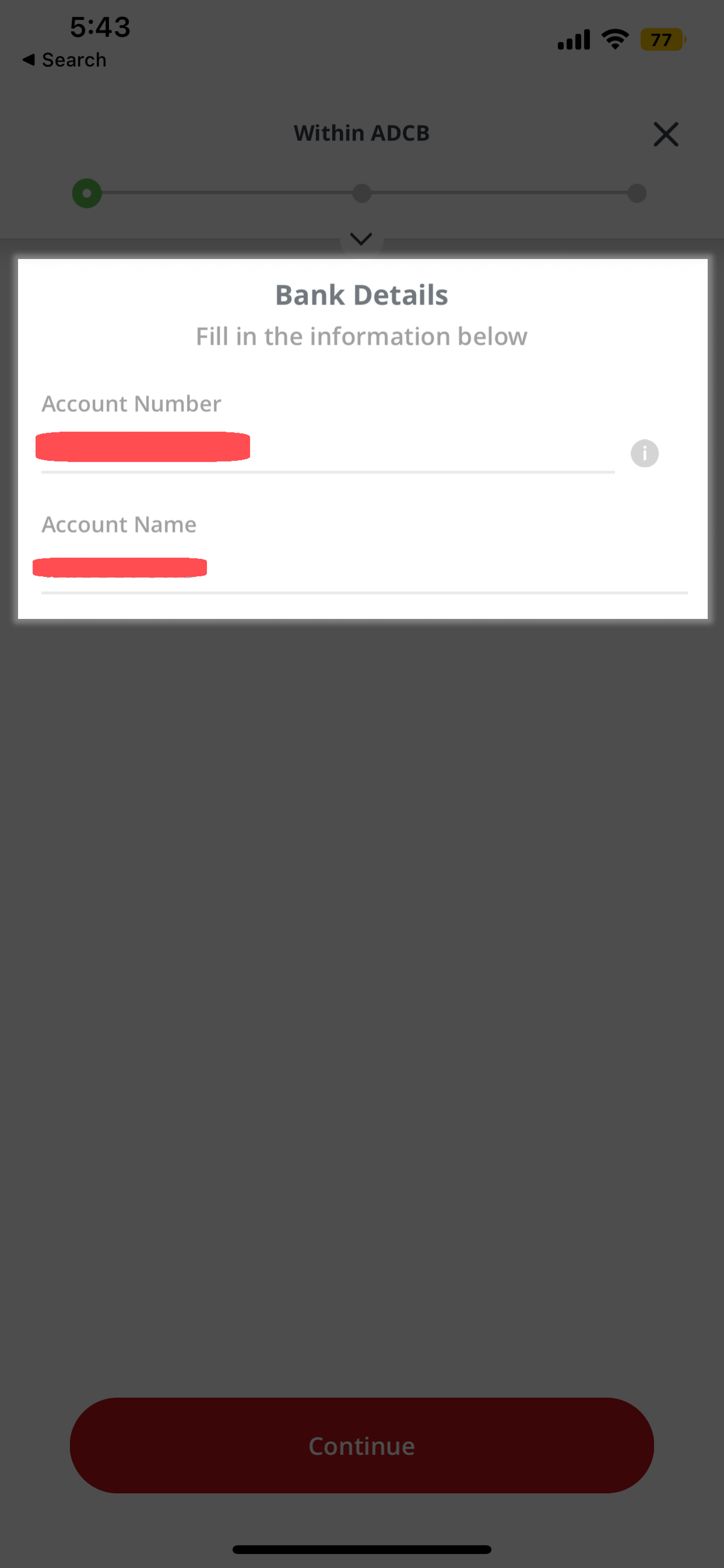
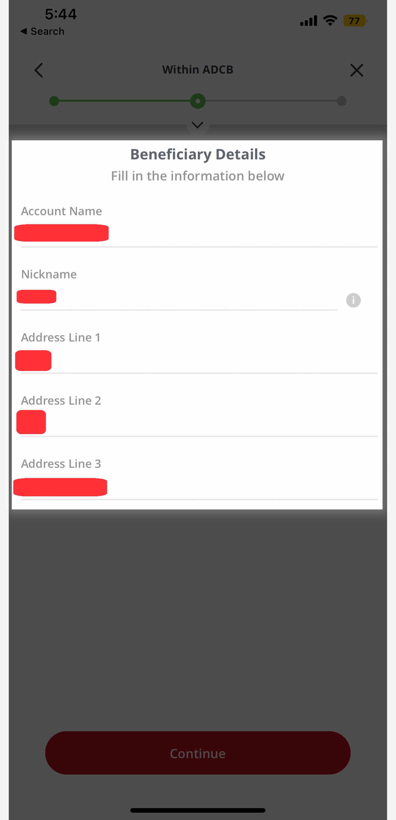
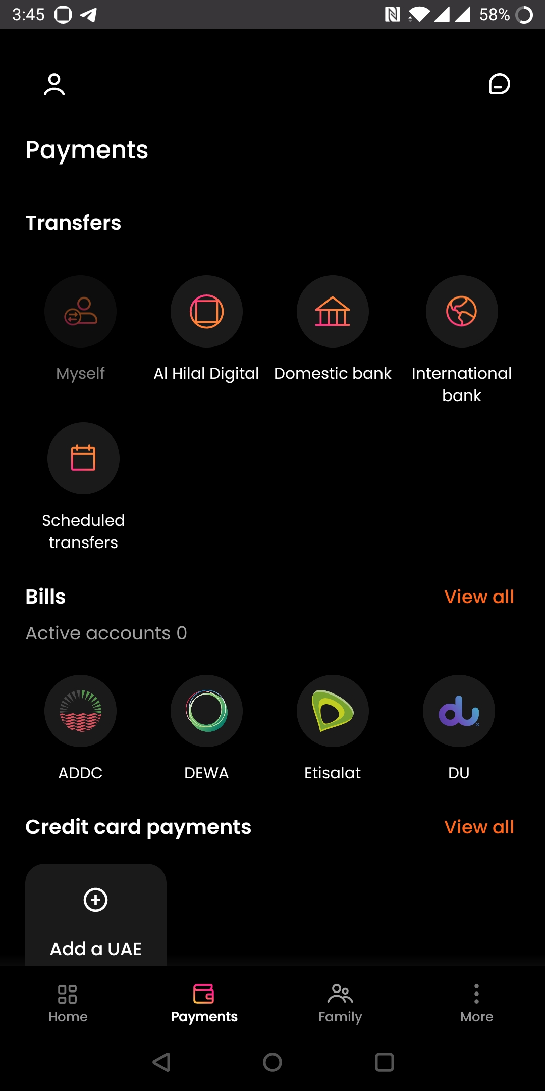
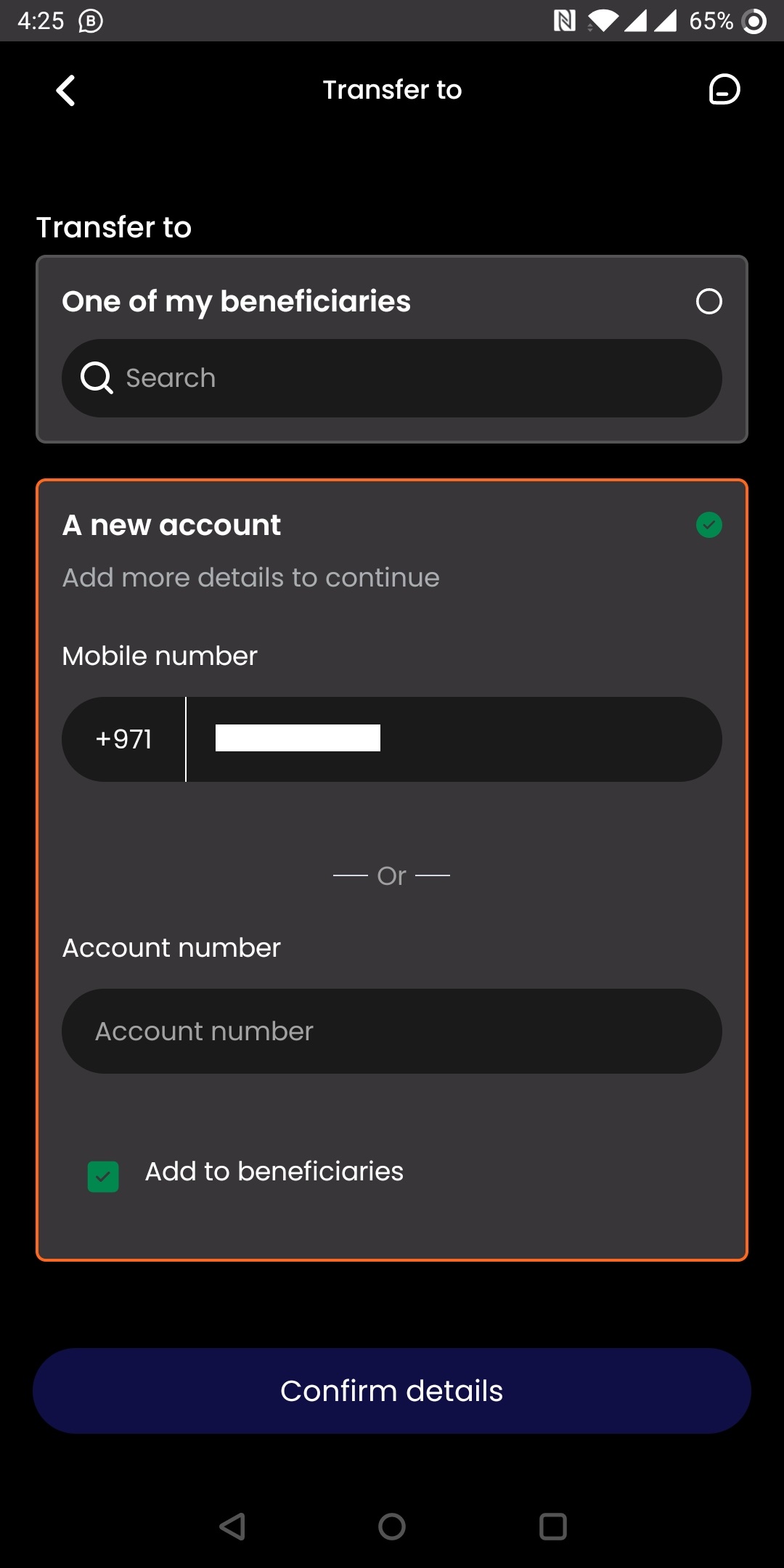
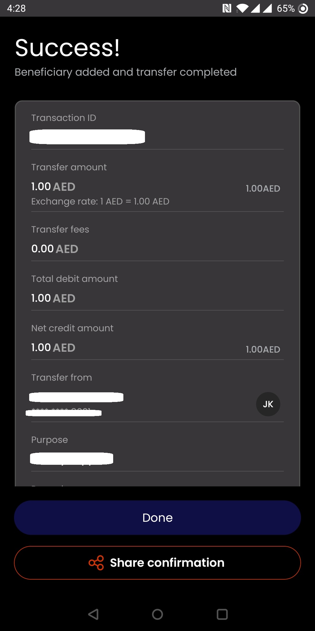
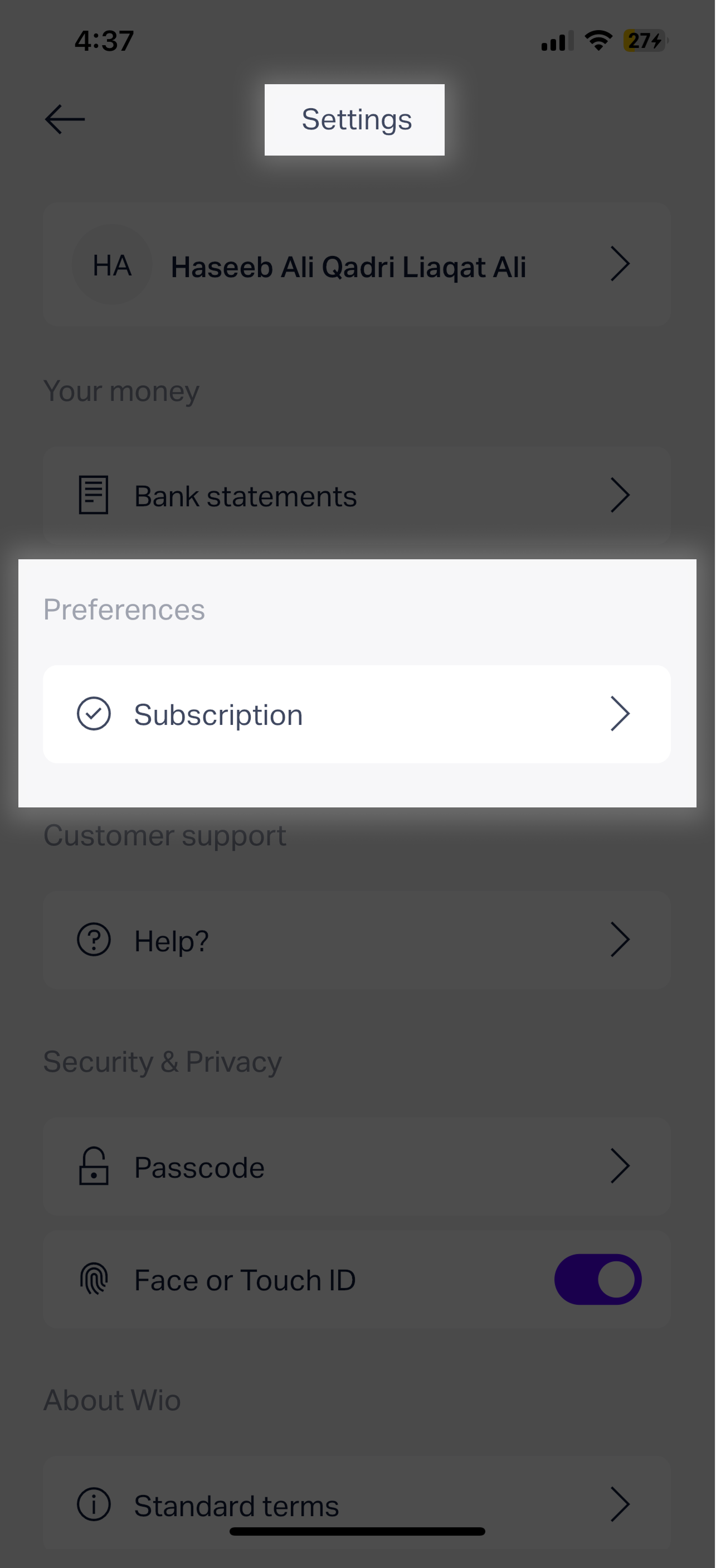
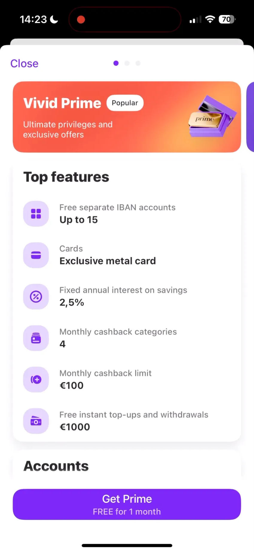
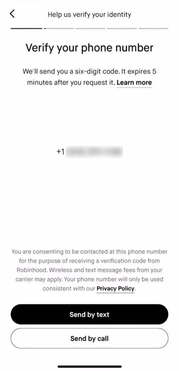
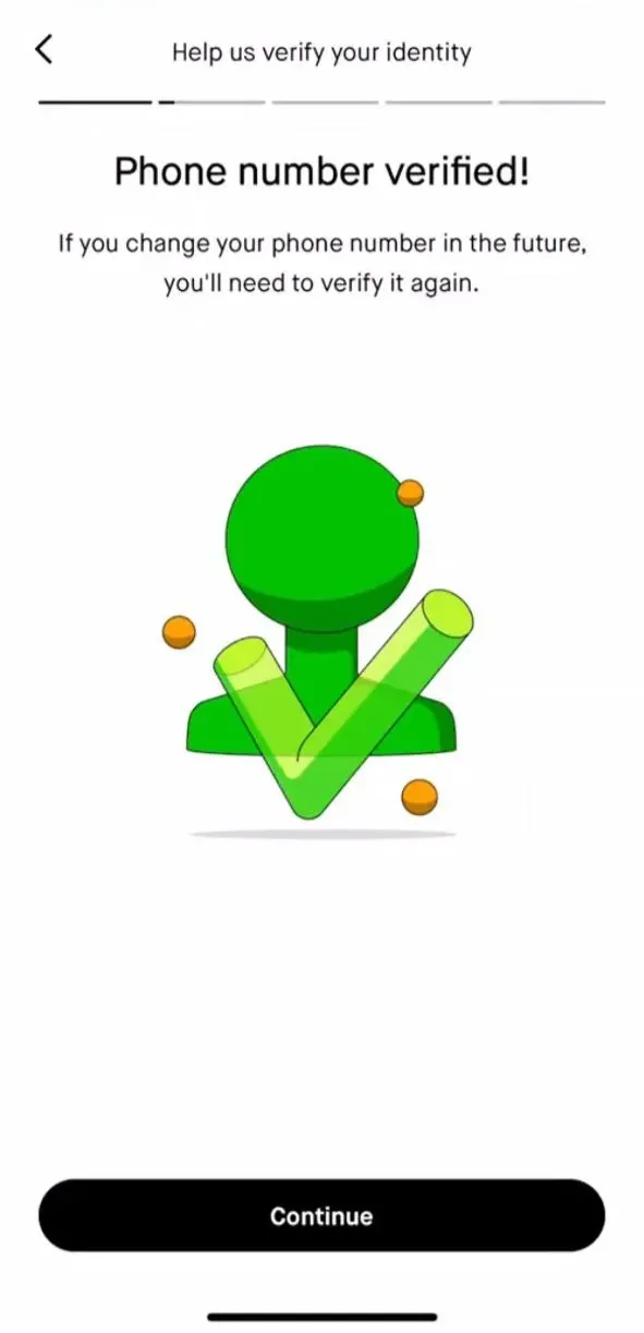
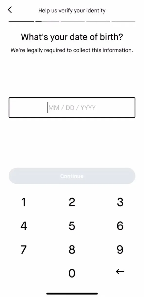
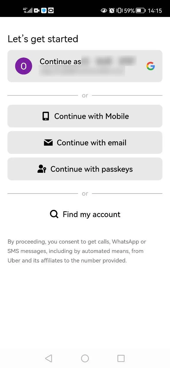
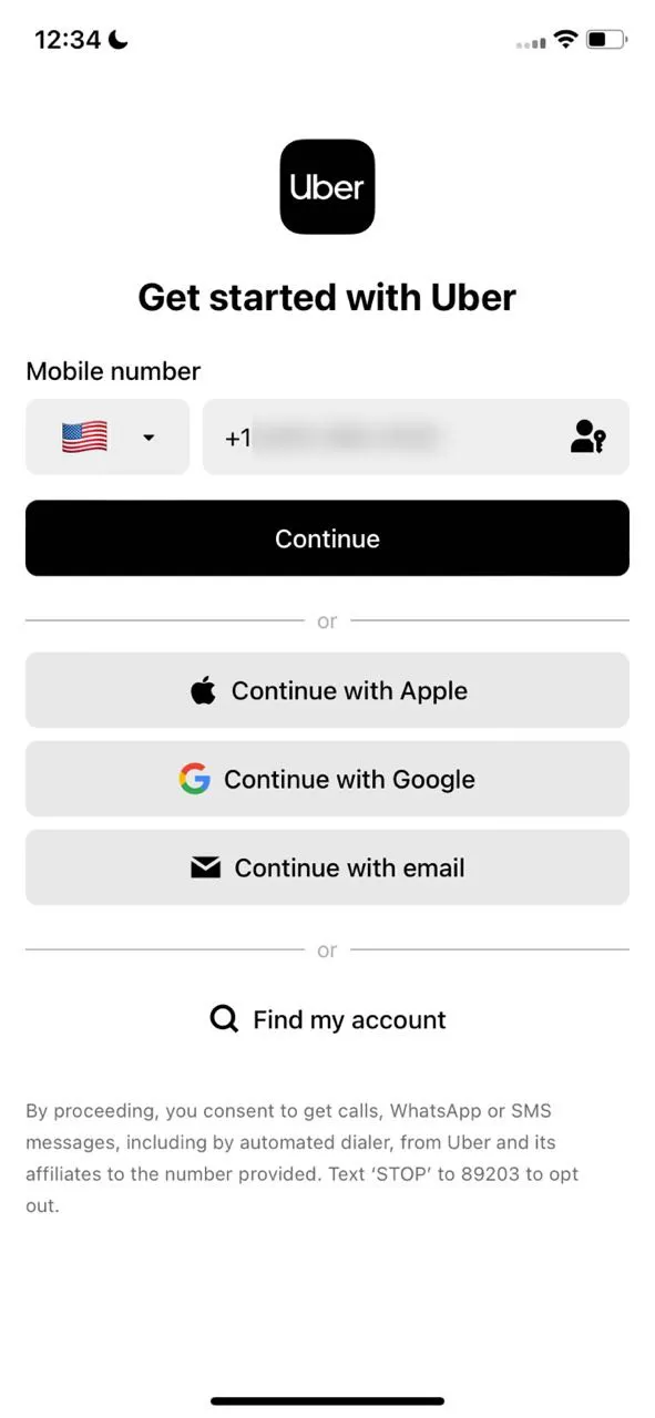
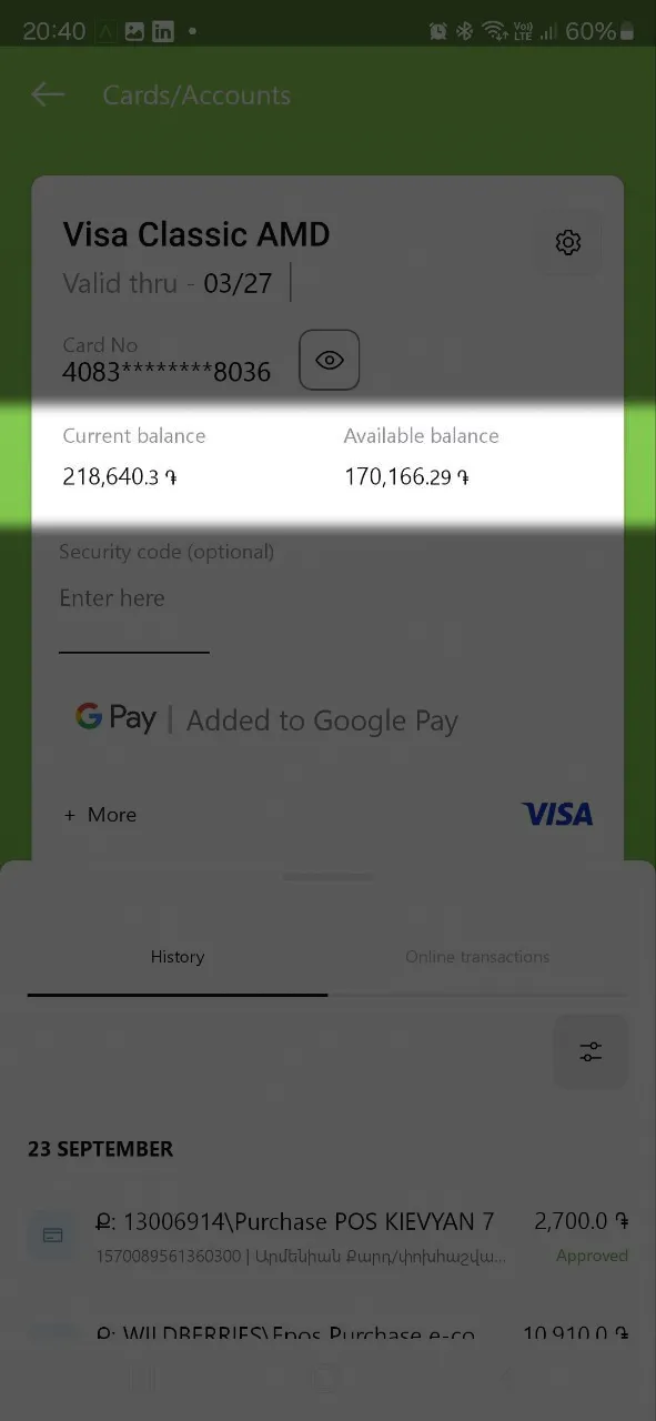
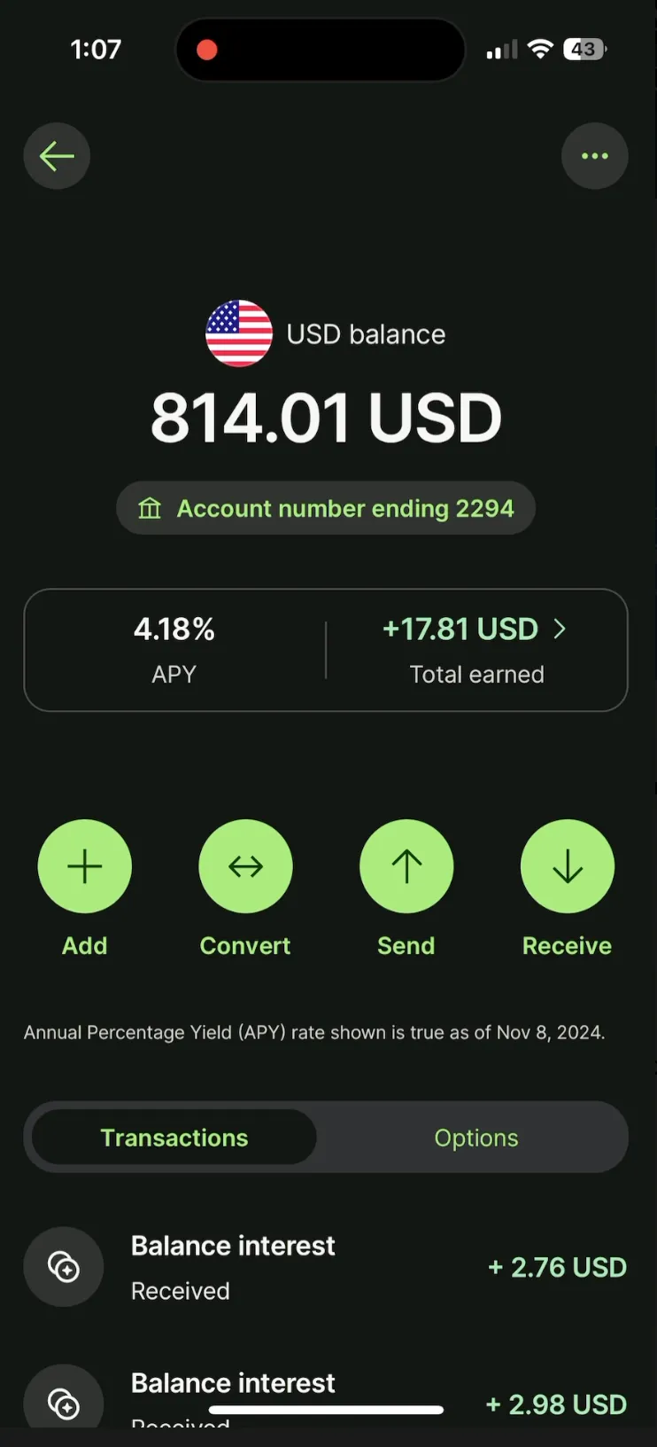
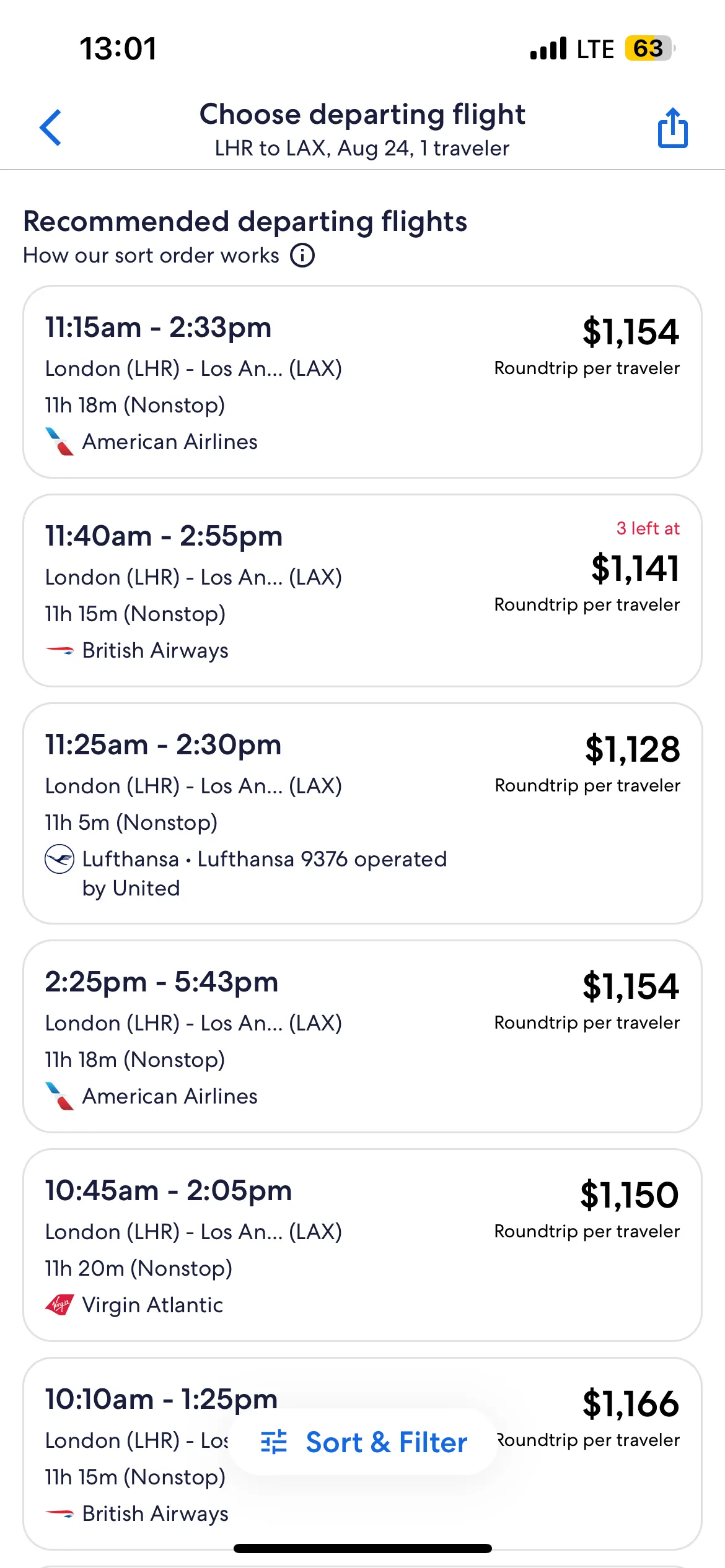
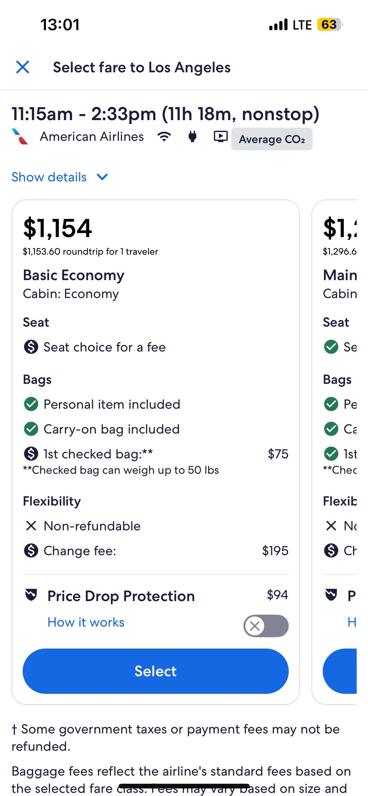
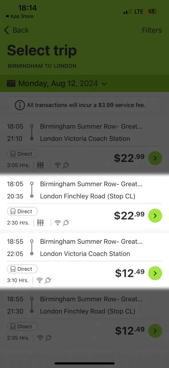
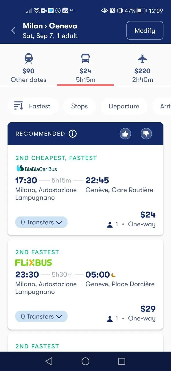
A knowledge base featuring real examples of UX problems from dozens of digital services in different countries. Each example is illustrated by a screenshot or screencast, described in English, and paired with an implementation from another service where this UX problem does not occur.
Open in NotionFrequency analysis
A statistical analysis of 363 UX problems from 89 apps and websites that reveals cross-industry patterns and industry-specific traits. Teams can benchmark against competitors, find quick wins, and plan improvements based on data, not opinions.
Download PDFChecklists for DIY audits
Financial services, travel, e-commerce, education, content platforms: five industry-specific checklists with key questions for assessing digital experience. A simple, practical tool for evaluating products with the specifics of each industry in mind.
Download PDFThe research & experience behind the classification
The classification is based on Markswebb UX researchers’ years of work analyzing thousands of interfaces. As examples, we selected 89 services across 7 industries, including fintech, foodtech, e-commerce, transportation, education, rentals, and government platforms. We excluded global tech giants, very small local services, and the gaming industry. Games weren’t considered because their core goal—prolonged engagement—differs fundamentally from services focused on efficiency.
1. Research scope
2. Classification
3. Analysis
4. Database
What we consider a UX problem
A UX problem is any situation that causes confusion or difficulty for users and prevents them from completing tasks confidently and efficiently. It’s not only about design flaws—it’s about their impact on the user.
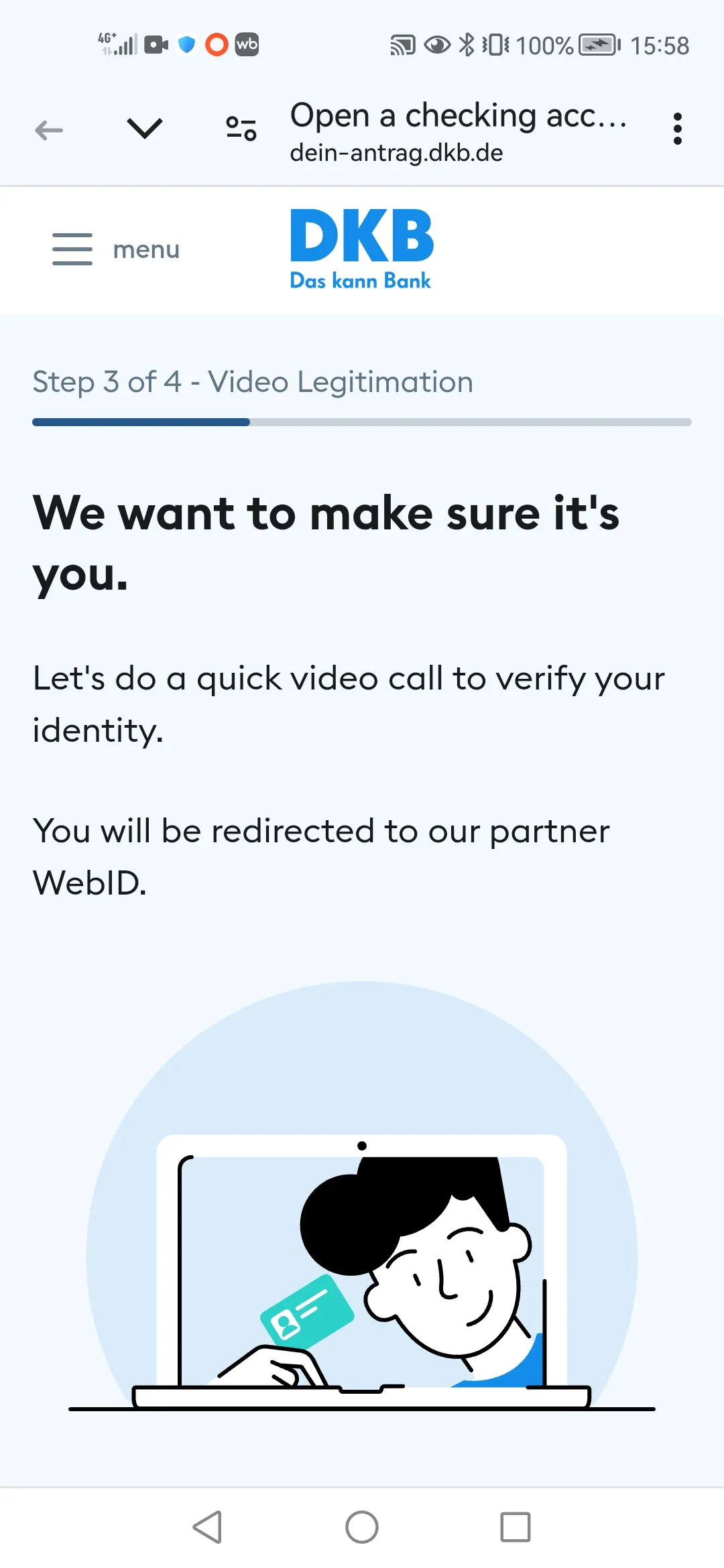
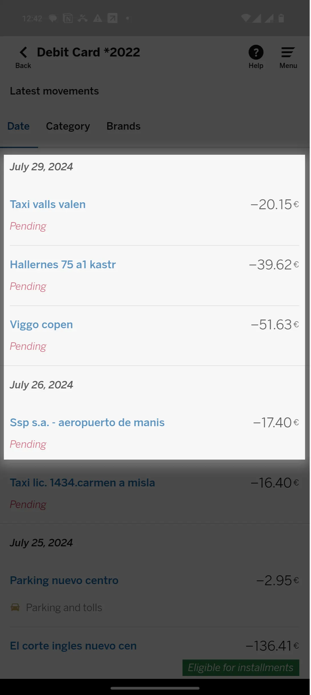
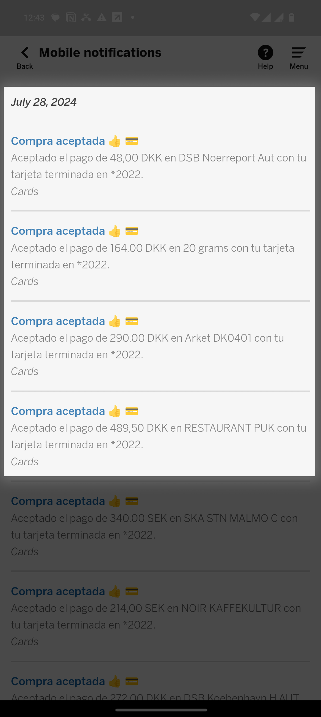
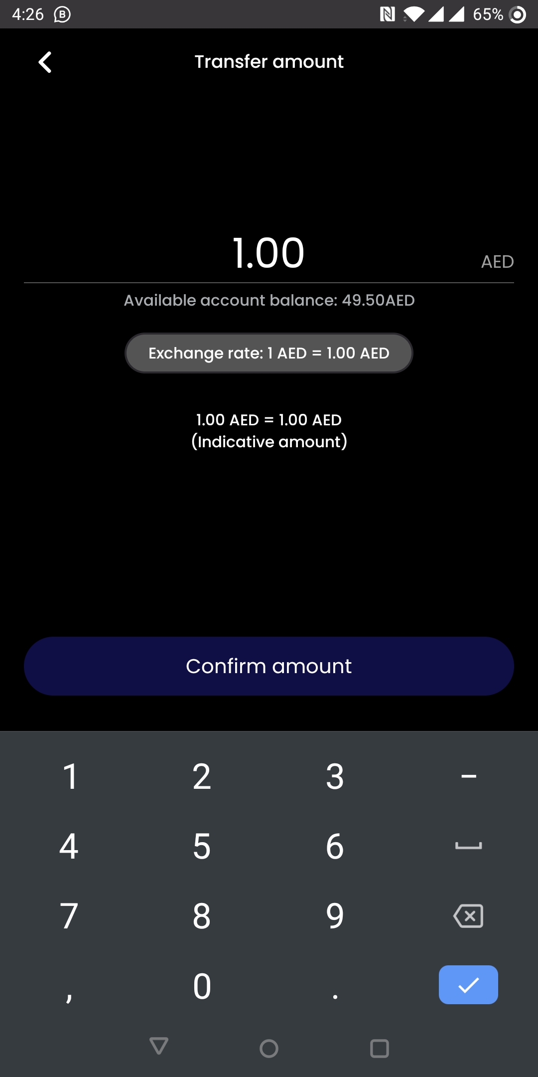
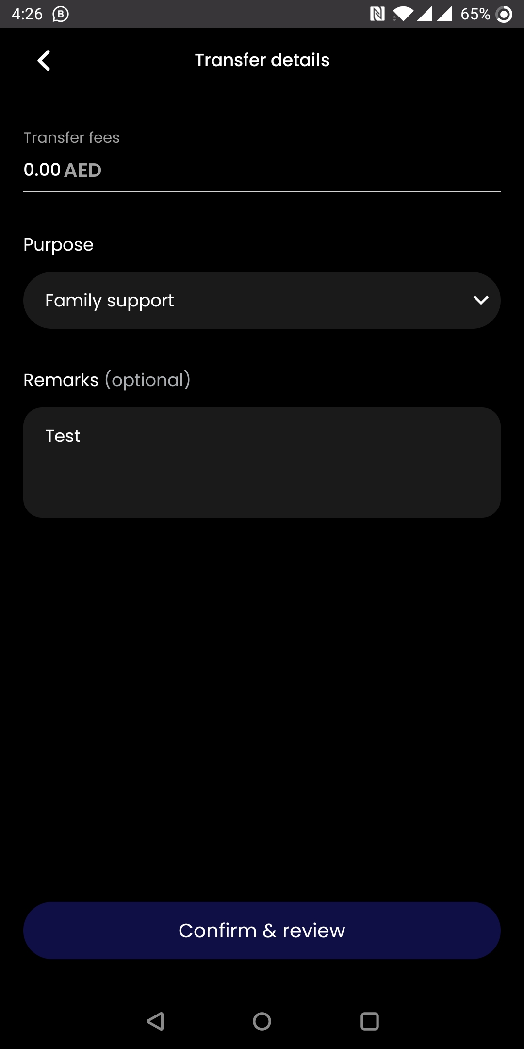
- One user can’t find crucial information buried deep in the service.
- Another gets tired of endless clicks and confusing navigation.
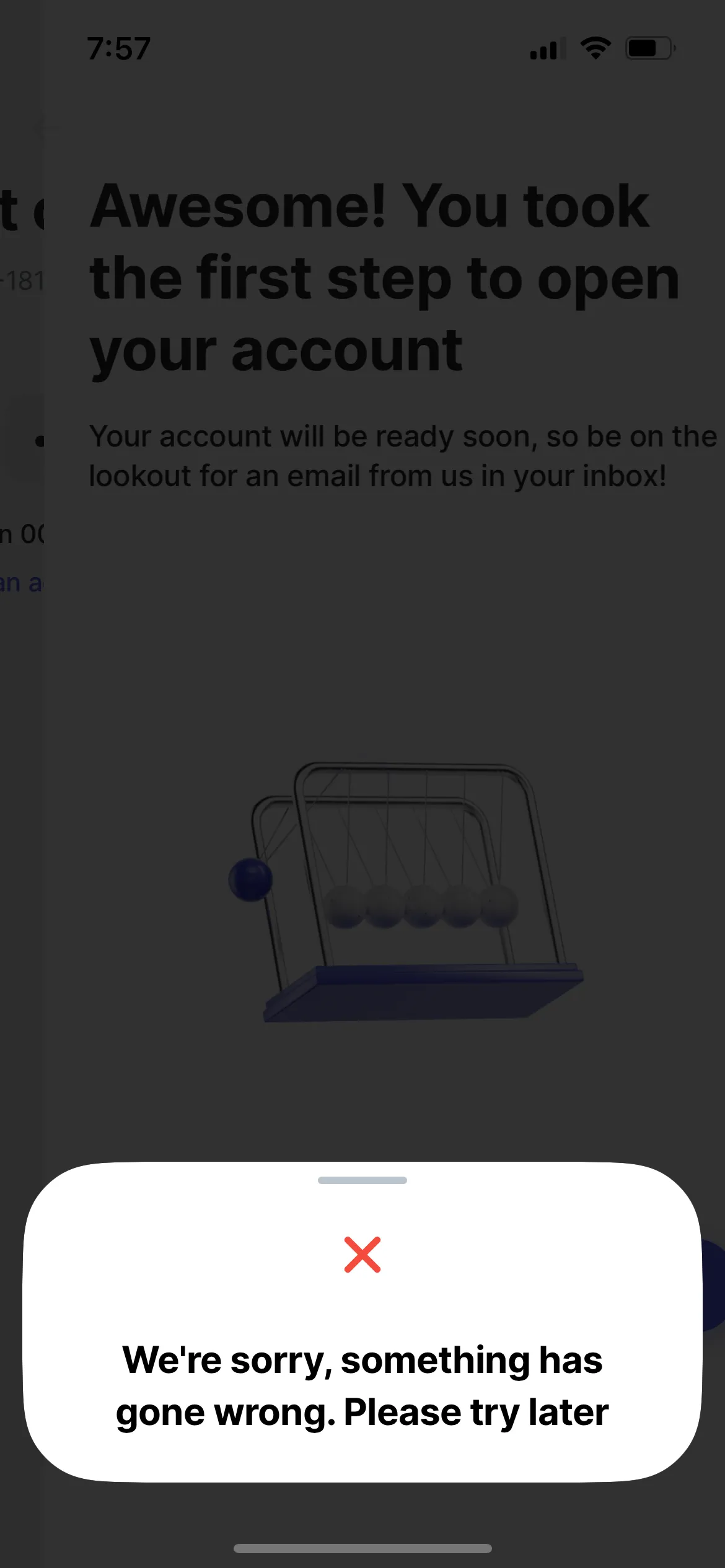
- A third gives up entirely after encountering an unclear error with no way forward.
This differs from marketing problems—such as irrelevant offers, a mismatched audience, or unclear value.

How to formulate UX problems
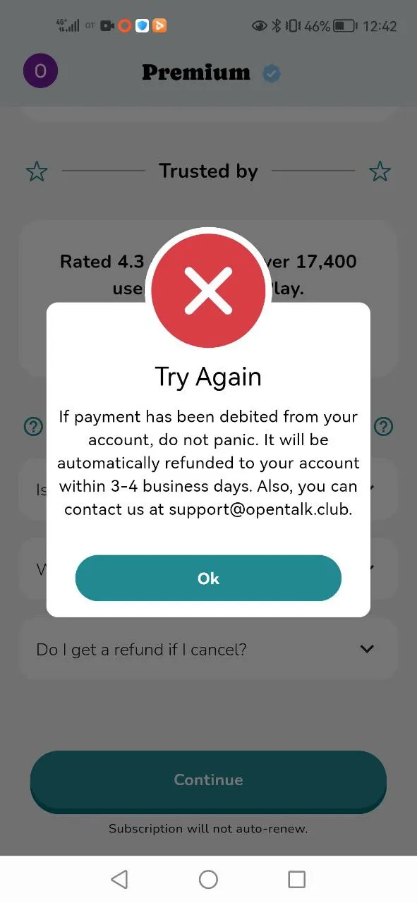
It’s important to describe the problem through real user feelings and experience, not through interface behavior. For example, «The button is too small» or «There are too few photos on the product page» are not UX problems, because they’re not tied to user tasks or perception.
But a wording like «The user doesn’t notice the payment confirmation button due to its small size and weak visual emphasis and therefore spends more time scanning the screen for actions» is a UX problem.
It’s equally important to justify why the problem truly matters. Ask:
- What can’t the user do without this feature?»
- What is the user forced to do now to get out of this situation?»
These answers help you formulate the problem correctly and prove its significance.
Prioritizing UX problems
Once problems are defined, they should be ranked by severity—the degree of impact on the user experience. The more critical the issue, the higher the risk users will feel frustrated, fail to reach their goals, and stop using the service. Accurate assessment helps teams focus on what matters.
High severity = blocker
Medium severity = irritant
Low severity = minor UX issue
Zero severity = opportunity
Why we know UX problems inside out

Our projects
Headquartered in Armenia, we evolve dozens of successful financial services for global companies in Russia, CIS, Europe and the USA.
and 100 more companies making innovative gidital products
Get in Touch
Looking for a partner? Lets Talk!
Markswebb
We respond to all messages as soon as possible.
- +34 666 89 37 94
- [email protected]
- Yerevan, Armenia